Good and Bad Examples
Soon, we will have a student-generated list of examples of data visualizations.
The following are good and bad visualizations as found and classified by students.
Good
- BBC Health
- Measles in the US
- More Measles in the US
- Examples on Find and Convert
- Dadaviz about Asian Food
- Obesity Rates
- States affected by same sex marriage ruling
- Declaration of Indepence (and where the signers were from)
- Twitters during soccer game
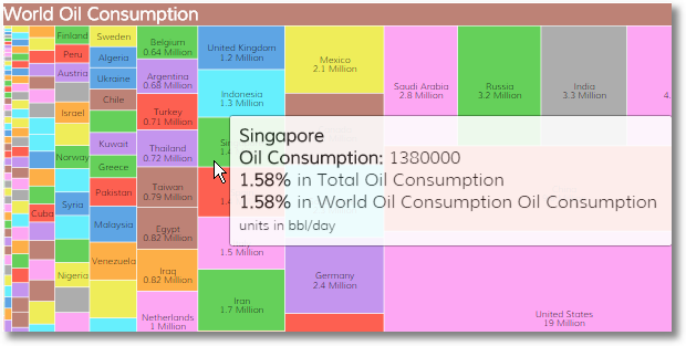
- World oil usage
- Map of National Parks
- Pizza Chain Geography
- Lines of Code
- Interactive Climate Change Info
- Global map of social networking
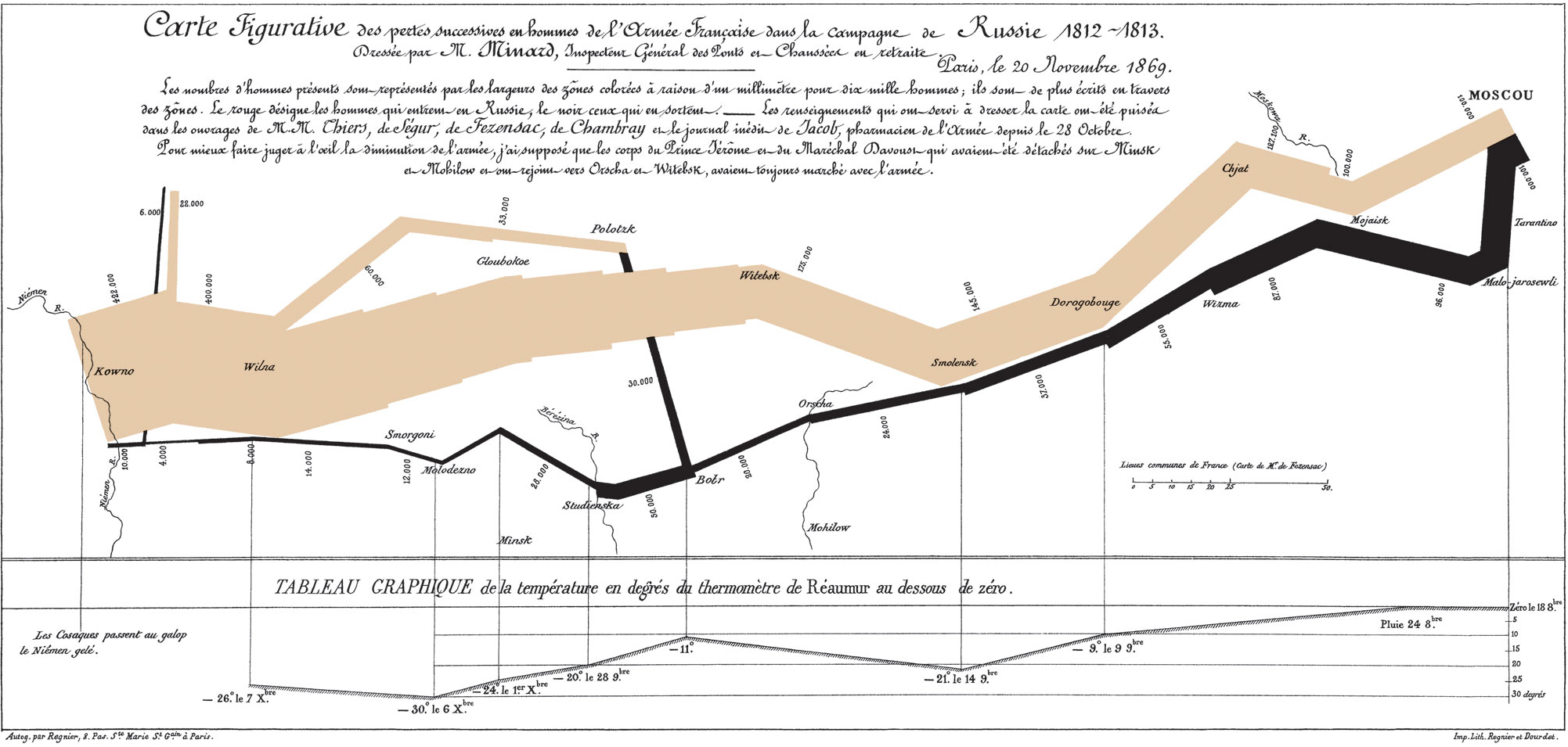
- Minard's Map of Napolean's March to Russia
- Tweets during Superbowl
- Height and Weight of NFL Players Over Time
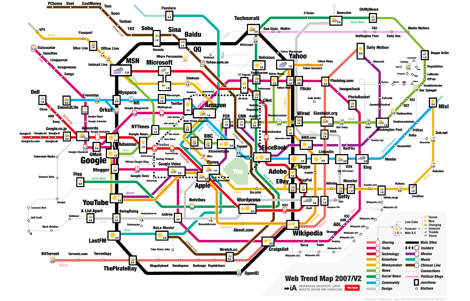
- Subway-type Map of Web Trends
- xkcd's Real life vs. Movies Hazards
- Computer Science Enrollments
- Patriots vs Seahawks by Nate Silver
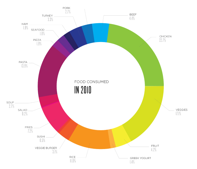
- Food Consumed in 2010
- Spacecraft mass and capacity measured in horses (xkcd)
- The Most Common Job in Every State (Planet Money)
- California Droughts (xkcd)
- Economic Stress Index
- The Scale of Space
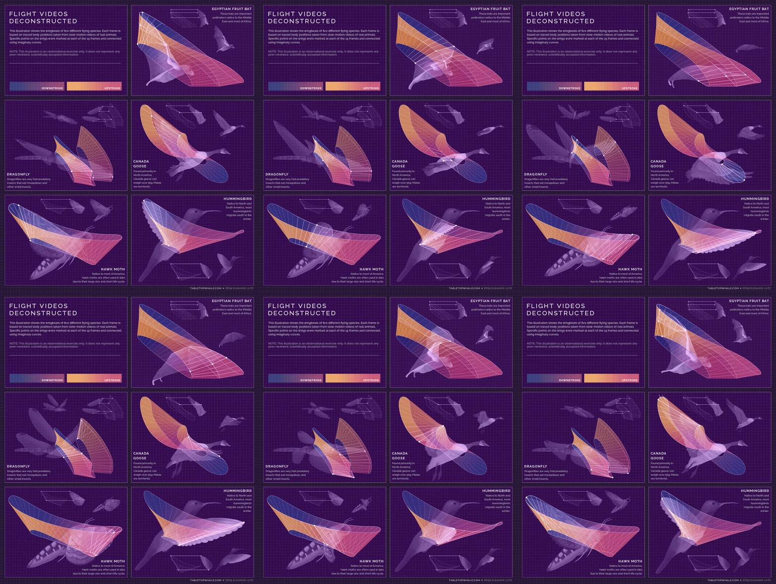
- Flight videos deconstructed
- One Second on the Internet
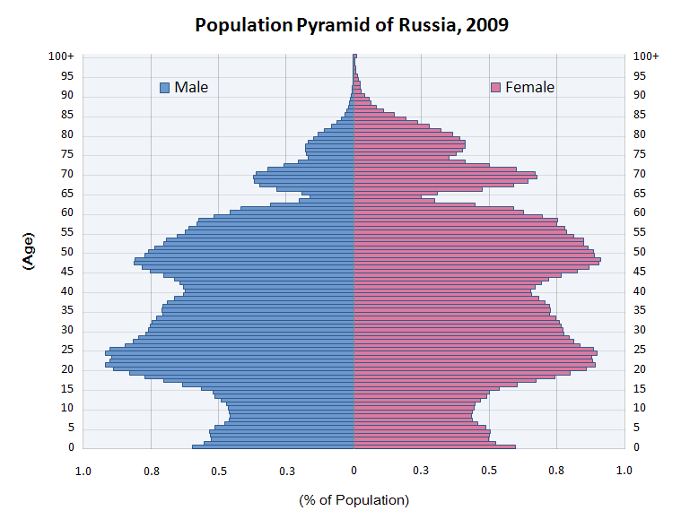
- Population Pyramid of Russia s
Bad
- Statistics How To
- Spurious Correlations
- WTF Visualizations
- Examples on Gizmodo
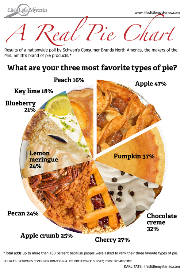
- Confusing Pie Chart
- Obesity Rates (not bad, but not as informative as the good one)
- Obesity rates vs Beer consumption
- Unemployment (scroll down to the bottomm for a fairly confusing graph)
- Spiral pie chart
- Shopping in China
- State's musical artist
- Emerging science and technology
- Unintentional Venn Diagram
- Fox New Pie Chart
- Angling for Silverlight
- Causes of Untimely Death
- Fox Bush Tax Cuts
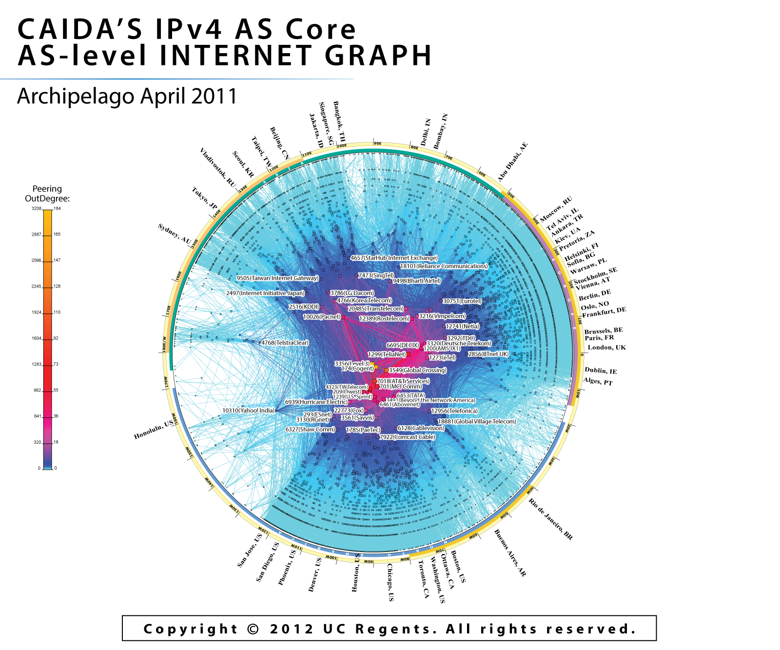
- IPv4 Core
- Public Outrage vs Actual Risk
- Misleading Pie Charts
- Batting Lead-off
- Beauty can be only skin deep
- 3D bar plot
- Anatomy of a good TED talk
- Online in 60 seconds
- 24-Hour Emergency Dentist
- Map of US with too many colors
- Gun deaths in Florida
- Color-coding in black and white