 Spring 2017
 Clustering
Due Monday 11 April 2016
The goal of this week's project is to add basic K-means clustering analysis to your program.
Tasks
Overall, you will need to add a clustering function to your Analysis class, create a new ClusterData child class of Data, and add elements to the GUI to enable the user to execute and view clusters.
-
Download the UCI activity recognition data sets below. These are a
data set collected from a cell phone's accelerometer and gyro of
30 individuals each undertaking six different actions: walking,
walking up , walking down, sitting, standing, and laying. There
are 561 features for each data point, along with a label about
what action the subject was doing at that time. You can find more
information at
the UCI
Machine Learning Repository.
For this task, download this classifier.py file. Run the file using the X and Y test data (it's smaller than the training data). You should get something like the this result.
In your writeup, explain what this program does and what the confusion matrix means.
Modify some aspect of the program to see if you can get better performance. Better performance will result in clusters that consist of a mostly a single label, with one cluster for each label. Explain what you did and why you thought it might improve the results.
- Add a write function to your Data class, enabling you to write out a selected set of headers to a specified file. The function should take in a filename and an optional list of the headers of the columns to write to the file. If you have not already done so, you should probably also give your Data object the ability to add a column of data.
-
Add the capability to execute a clustering on the currently open
data file. You will need to get from the user the set of data
headers to use in the clustering and the number of clusters to
create. Once you have executed the clustering, you can do one of
two things.
- Option 1: Add the cluster IDs to the current Data object, giving the cluster IDs a new header. Note that you may end up with multiple cluster ID columns if you add a new one for each clustering analysis.
- Option 2: Save a copy of your data plus the cluster IDs to a new data file. Then you can open the new file and do plots with it. You can choose to save all of the data, just the data used to make the clusters, or let the user choose.
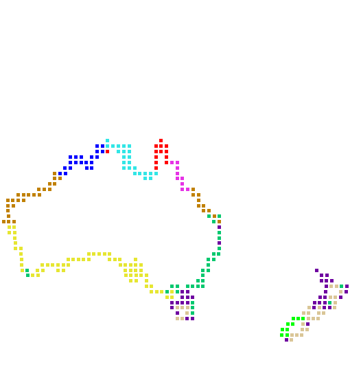
- One of the best ways to visualize clusters is to use color, giving each cluster a unique color. Ideally, you want to have a pre-selected set of easily differentiated colors from which to choose, rather than picking random colors. To color the clusters effectively, you will need to let the user pick what color scheme to use for the color axis. This could be as simple as a checkbox indicating whtether to use a smooth color scheme or a set of preselected colors. In any case, you want to be able to generate an image like the one in the upper left of this page.
- Cluster the Australia Coast data set into 10 clusters and visualize the result. Include a picture of this in your writeup.
- Cluster a data set of your choice, using the result to demonstrate a characteristic of the data set. Include a picture of your visualization in your writeup. You may create a synthetic data set if you wish, just be sure to describe how you did it.
Extensions
- Add different distance metrics to your clustering algorithm. Show comparisons of the differences in results.
- Add features to the clustering algorithm, such as letting the user select the distance metric or other parameters of the clustering algorithms.
- Run PCA on the AustraliaCoast data set and then cluster using the first three PCA dimensions. Visualize the result in PCA space.
- Implement other clustering methods.
- Enable the user to view the cluster means in their plots. Give the cluster means names.
- Do more exploration with the UCI activity recognition data set. See if you can visualize the data set.
Writeup
Make a wiki page for the project report.
- Write a brief summary of your project that describes the purpose, the task, and your solution to it. The summary should be 200 words or less.
- Write a brief description of how you implemented the PCA algorithm and modified your Data and Display/Application classes.
- Incorporate screen shots showing a visualization of the Australia Coast data set into your report. Focus integrating the text and figures.
- Be sure to document and describe any extensions.
- Summarize what you learned and identify any collaborators/assistance.
Handin
Once you have written up your assignment, give the page the label:
cs251s17project7
Put your code on the handin server in a project7 directory in your private subdirectory.